
|
Our Logo |
||
|
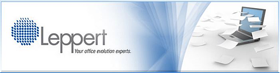
This is a free form symbol. The whole representative of the numerous components of Leppert's business, the sum of the parts that make up an office. The organization of the components is symbolic of an integrated office. Each dot is characteristic of a different component in the office environment. Like a well-planned office, components can be reorganized and added to strengthen the whole. |
The type style is fresh and current, yet the square slab serifs provide a more traditional strength. This is in keeping with Leppert being a strong, well-established firm that has kept up with the times. The two P's are deliberately joined to aid in the pronunciation, as if there were only one P. We have leveraged the colour blue that has been the Leppert standard for many years. The wordmark is simple, uncomplicated and represents how Leppert does business. |
|
The slogan is a presentation of exactly what Leppert is as a company and how it operates. The words are simple and concise; the meaning is in each individual word. On their own, the words make up each part of Leppert. As a slogan, the words come together to form a clear, memorable identification. Your – invokes customer and emphasizes Leppert's customer-centric principles |
||